🔍 What's This Iron Mining Process About?
We are analyzing a flotation process, a crucial step in mineral processing where the goal is to selectively extract valuable iron minerals from unwanted silica (waste), ultimately producing a high-grade iron concentrate.
Our dataset provides insights into key aspects of this process, including:
- What goes into the system: Characteristics of the raw ore feed (% Iron Feed, % Silica Feed).
- How the process is controlled: Operational parameters we can adjust (Air Flow, Column Levels, Chemical Reagent Flows like Starch and Amina, Ore Pulp pH, Ore Pulp Density, Ore Pulp Flow).
- What comes out: The quality of our final product (% Iron Concentrate, % Silica Concentrate).
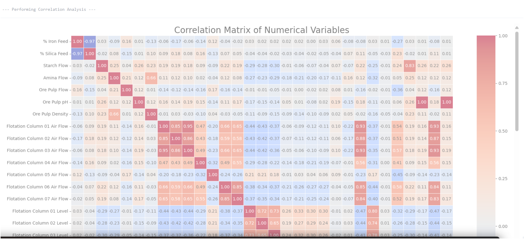
⚙️ Why Are We Studying Correlation?
Understanding correlations allows us to identify how changes in our control parameters or feed characteristics influence the quality and efficiency of our output. Essentially, we're looking at how one variable affects another.
For example:
- Does more iron in the input (feed) directly lead to more iron in the output (concentrate)?
- Does increasing or adjusting chemical dosages help or hurt our separation efficiency?
- How does the in the flotation columns impact the process?
Airflow: Volume and Dispersion of Air in Flotation Cells
In flotation cells, air bubbles are critically important. Iron minerals are made water-repellent (hydrophobic) via chemical agents and attach to these air bubbles. Conversely, in reverse flotation, unwanted minerals (gangue) are made hydrophobic to float away, leaving iron behind.
Diffused air bubbles provide a large surface area for mineral particles to attach. If airflow is too low, we might experience poor recovery rates due to insufficient bubble surface. Mechanical impellers mix the mineral pulp with reagents and air, ensuring other chemicals like collectors, frothers, depressants, and pH modifiers selectively promote attachment to the desired iron minerals.
Air bubble size is crucial: it cannot be too large (poor selectivity) or too small (excessive froth stability). Froth stability is also a key focus point, as an unstable froth can lead to loss of valuable minerals, while an overly stable froth can entrain too much waste.
Liquid Level / Pulp Level
The liquid height (pulp level) in the flotation tank significantly affects the residence time of the material and the effectiveness of the separation process. A carefully controlled pulp level ensures optimal particle-bubble contact and allows for effective froth cleaning, which helps in cleanly separating iron from waste.
🧪 Why Unpacking Relationships is Critical
In a well-performing plant, we expect predictable outcomes. For instance, if iron content in the feed increases, we should ideally see a corresponding increase in the iron content of our concentrate. If this relationship isn't observed or is unexpectedly weak, it signals a deeper issue:
- The system might be **Broken**: A mechanical failure, sensor issue, or severe operational deviation.
- The process might be **Not Optimized**: Operating within safe limits, but not at peak efficiency for current conditions.
- Our data might be **Not Lined Up Right**: There could be a time lag between an input change and its observable effect on the output (e.g., feed affects output 30 minutes later).
📈 My Key Performance Indicators (KPIs) Cheat Sheet in Iron Ore Flotation
Numbers You Want to GO UP
| Metric | Why it Matters | How Airflow & Pulp Level Impact It |
|---|---|---|
| Iron Recovery (%) | This is the percentage of valuable iron from the original ore that you successfully capture in our final concentrate. Higher recovery means less waste and more product to sell. |
|
| Iron Concentrate Grade (%) | This is the purity of our final iron product, typically the percentage of Fe (iron) in the concentrate. A higher grade means a more valuable product for steelmaking, commanding a better price. |
|
| Throughput (Tons/Hour) | The rate at which the flotation circuit processes ore. Higher throughput often means more overall production. |
|
| Concentrate Volume/Mass | The total amount of salable iron concentrate produced over a period. |
|
📉 Numbers You Want to GO DOWN
| Metric | Why it Matters | How Airflow & Pulp Level Impact It |
|---|---|---|
| Gangue Content (%) | High gangue = lower-grade product and higher downstream costs. |
|
| Reagent Consumption | Chemicals are costly—optimizing reduces waste. |
|
| Energy Consumption | Lower energy = better efficiency and cost savings. |
|
| Tailings Iron Content (%) | More iron in tailings = lower recovery and profits. |
|
Other Key Considerations
- Particle Size Distribution: Avoid excessive ultrafines (slimes) for better flotation.
- pH: Crucial for reagent effectiveness and surface chemistry.
- Slurry Density: Affects reagent dosage and particle contact.
- Froth Stability: Needs balance—too stable or unstable both hurt.
Monitor these metrics and adjust air flow and pulp level accordingly to maximize iron recovery and reduce processing costs.
What Should You Do With These Numbers?
🧠 Step 1: Analyze correlation results and identify helpful vs. harmful settings
To Increase Iron (%Fe):
Column 05 Level- pulp height - shows a slight positive correlation with Iron content (+0.16). While not strong, it may be worth monitoring or controlling more closely. Also Column 06 Level could be increasing too, as their correlation to % Iron concentrate is the second highest: (+0.146). We could also think of increasing Column 3 Air flow too as its correlation to target is +0.10, more air in this column could float the right minerals.
To Reduce Silica (%SiO₂):
Column 01 Airflow is the most negatively correlated with Silica (-0.219), thus increasing them means less Silica. Similarly, increasing Column 03 Airflow which is at (-0.218) correlated with %SiO2 would reduce Sicica output.
What’s Hurting Performance?
Similarly, we can see that increasing Column 01 Level would increase Silica concentrate, which are positively correlated at (+0.017); while implying less on our % Iron concentrate, which are plausible as negatively correlated with Column 01 Level at (-0.014).
✅ Step 2: Plot It Out (Visual Inspection)
Use scatter plots to visually understand the relationships:
After just one or two graphs for general ideas about this dataset, now we are visualizing almost all plots for features vs target
Through visual inspection, we can often identify:
- Is there a "sweet spot" or optimal range for an input? By identifying the sweet spot, we are aware of our optimal range, thus we could be proactive in not operating in a suboptimal region, which means wasting resources, or producing a lower-quality product than possible
- For example: with Ore Pulp pH and % Silica Concentrate, a U-shaped sweet spot means there's a specific pH where silica is best rejected. Thus our sweet spot is the wanted range. Too acidic or too alkaline, and more silica might report to our concentrate, reducing product quality.
Take a look at my Deepnote notebook. This platform is brilliant, I really like them. Comparing Deepnote with Google Colab or Jupyter notebook would be for another blog post.
✅ Step 3: Try some machine learning model
Use a machine learning model to see which variables truly matter and have the most predictive power over our outputs:
This analysis will show which process inputs **have the most power to influence our product quality**, even if their simple correlations seem weak due to complex interactions.
🔍 Additional Advanced Analysis Techniques
4. 🔄 Align Data by Time (Handling Lags) in Time Series Analysis
In continuous processes, inputs don't instantly affect outputs; there's often a **time delay**. For example, a change in feed properties might only be reflected in the final concentrate after pulp flows through all columns.
We use Random Forest model to predict the efficiency of an iron ore concentration process, using recent and lagged sensor readings. The model is evaluated using both a test set and OOB (Out-of-Bag) validation for reliability.
Testing various lags (e.g., 5, 10, 15 minutes) and looking for the strongest correlation will help identify the true time delay for cause-and-effect relationships.
Summary & Call to Action
This analysis has aimed to provide a data-driven understanding of our iron ore flotation process. Key takeaways include:
- We're examining how our **plant settings (air, level, chemicals)** and **input quality (iron feed)** directly impact our **final product quality** and **efficiency**.
- Initial findings suggest that basic correlations might not fully capture the complexity, particularly where we observe a **disconnection between feed grade and final product quality** – a significant red flag.
- We've identified the need to account for **time lags** and utilize **more advanced modeling techniques** to uncover the true drivers of our process.
🏁 Final Thoughts: Bridging Data to Operations
The observation that iron in the feed isn't consistently leading to better iron in the product points to potential **deep inefficiencies or untapped optimization opportunities** within our current operational strategy. This is a critical point to address.
Recommendation: Present these findings to operations and the process engineering team. Specifically, ask:
"Why doesn't increased iron in the feed consistently translate to higher iron in the product concentrate? What process parameters or equipment limitations might be causing this apparent bottleneck, and how can we investigate further through targeted adjustments or process studies?"
Understanding and rectifying this gap is paramount for improving our product quality, maximizing yield, and enhancing overall profitability.
Executive Summary: Iron Ore Flotation Performance Trends
This report provides an overview of our iron ore flotation circuit's key performance indicators (KPIs) and highlights recent trends that impact our operational efficiency and product quality. Our primary goals remain maximizing iron recovery and concentrate grade while minimizing waste.
Key Performance at a Glance
- % Iron Concentrate (Product Quality):
- Trend: Over the past quarter, our average iron concentrate grade has shown a slight decline, settling around [X]% Fe, down from [Y]% Fe in the previous period. While still within an acceptable range, this trend warrants closer investigation to maintain our competitive edge.
- Implication: A sustained lower grade can impact market value and downstream processing costs.
- % Silica Concentrate (Waste in Product):
- Trend: Corresponding with the iron grade, we've observed a marginal increase in silica content, now averaging [A]% SiO₂. This indicates reduced gangue rejection efficiency.
- Implication: Higher silica means a less pure product, potentially leading to penalties or increased refinement costs for our customers.
- Iron Recovery (%) (Efficiency):
- Trend: Our overall iron recovery has remained relatively stable at approximately [R]%, demonstrating consistent mineral capture despite fluctuations in concentrate grade.
- Implication: Maintaining high recovery is crucial for maximizing yield from our raw ore.
Driving Factors & Next Steps
Our analysis indicates that recent variability in Ore Pulp pH and minor fluctuations in Flotation Column Air Flow are likely contributing to the observed trends. While no critical system failures ("broken" states) have been identified, the data suggests areas where our process is not fully optimized.
Specifically, we've noted:
- Periods where Ore Pulp pH deviates from its optimal range, directly correlating with drops in concentrate quality.
- Inconsistent Air Flow settings across flotation columns, suggesting opportunities to fine-tune bubble generation and froth stability for better separation.
- Initial investigations into time lags suggest that changes in Ore Pulp Flow and pH can take approximately [Z] minutes to fully reflect in our final concentrate quality, a crucial factor for proactive adjustments.
Our immediate next steps will focus on:
By addressing these optimization opportunities, we aim to revert the current trend in concentrate grade, improve silica rejection, and ensure sustained high recovery.