Project 1: A Excel Skill Share Project Reflection
I enjoy working on Skill Share projects—they offer a great way to express ideas, share knowledge, and build a personal brand while connecting with others in the community. That said, it’s easy to feel overwhelmed by the sheer volume of ideas available.
At American Family Insurance, I gained practical experience working with IBM mainframe databases, Apex CRM, Guidewire, and Salesforce. That exposure helped me understand how technology can act as a powerful assistant when solving real business problems.
My academic background trained me in analytical thinking and structured decision-making. It’s not just about collecting knowledge—it's about applying technology thoughtfully and effectively to deliver impact.
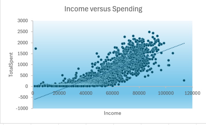
Today, imagine working at DoorDash on a promotional campaign. The data engineers have already prepared the datasets—now it’s your turn to uncover insights that can drive business decisions.
Excel Tips and Tricks
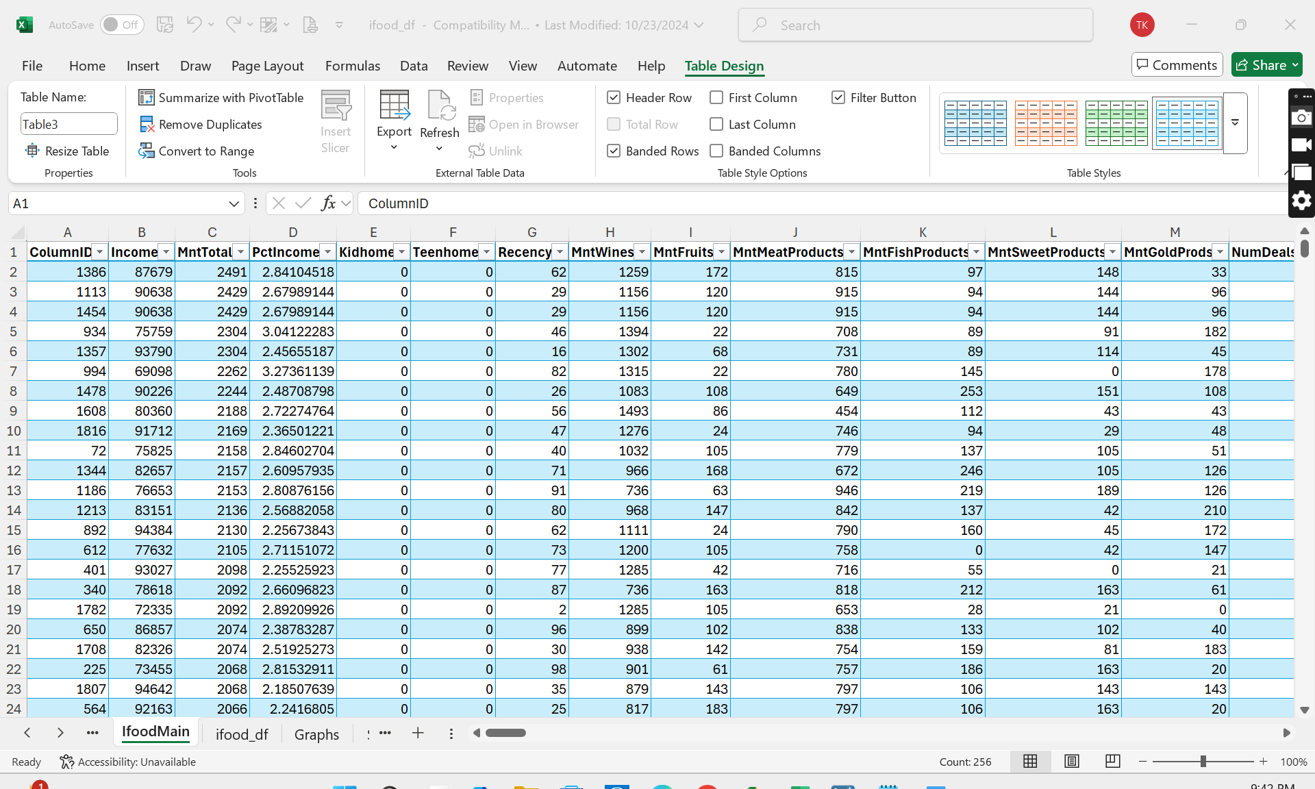
- Use Ctrl + A to select all data, then format as a table with Ctrl + T. Create a new worksheet with Ctrl + Shift + N to keep your workspace organized.
- Name your tables using the “Define Name” feature—especially helpful when working with multiple sheets or writing formulas across files.
- Use “Remove Duplicates” and “Filter” to identify missing or inconsistent data that could skew your analysis.
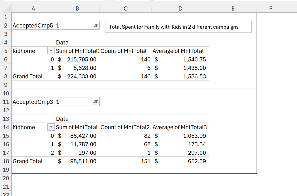
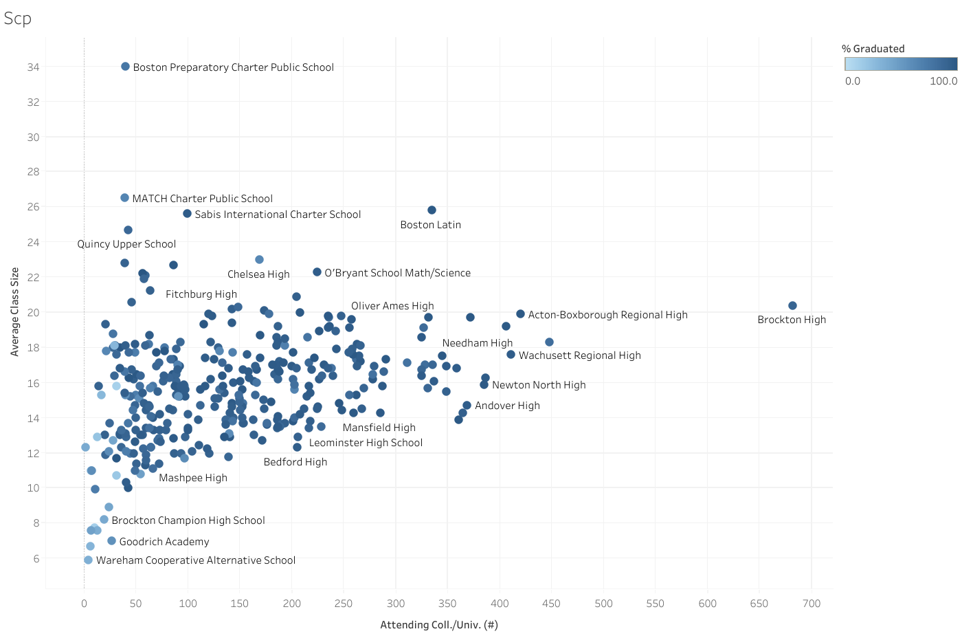
Why Pivot Tables Matter
Pivot Tables help you explore patterns in your data. They're especially useful for:
- Aggregating data: totals, averages, counts, and more
- Slicing and filtering by categories to uncover trends
For example, I discovered that older adults tend to order more frequently online—a pattern that aligned with my own observations. Tools like Pivot Tables allowed me to validate this trend using real data.
If you're interested, I also recorded a short walkthrough of this project where I discuss the findings and share ideas that might inspire your next campaign.
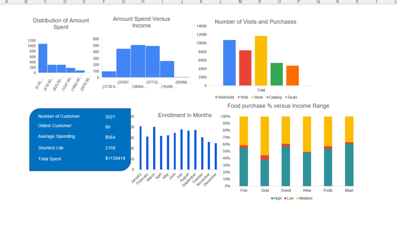
Being part of the Data Career Jumpstart community has been a great learning experience. It’s inspiring to see how differently people approach the same dataset. With Exploratory Data Analysis (EDA), even one dataset can tell many stories depending on who's analyzing it.
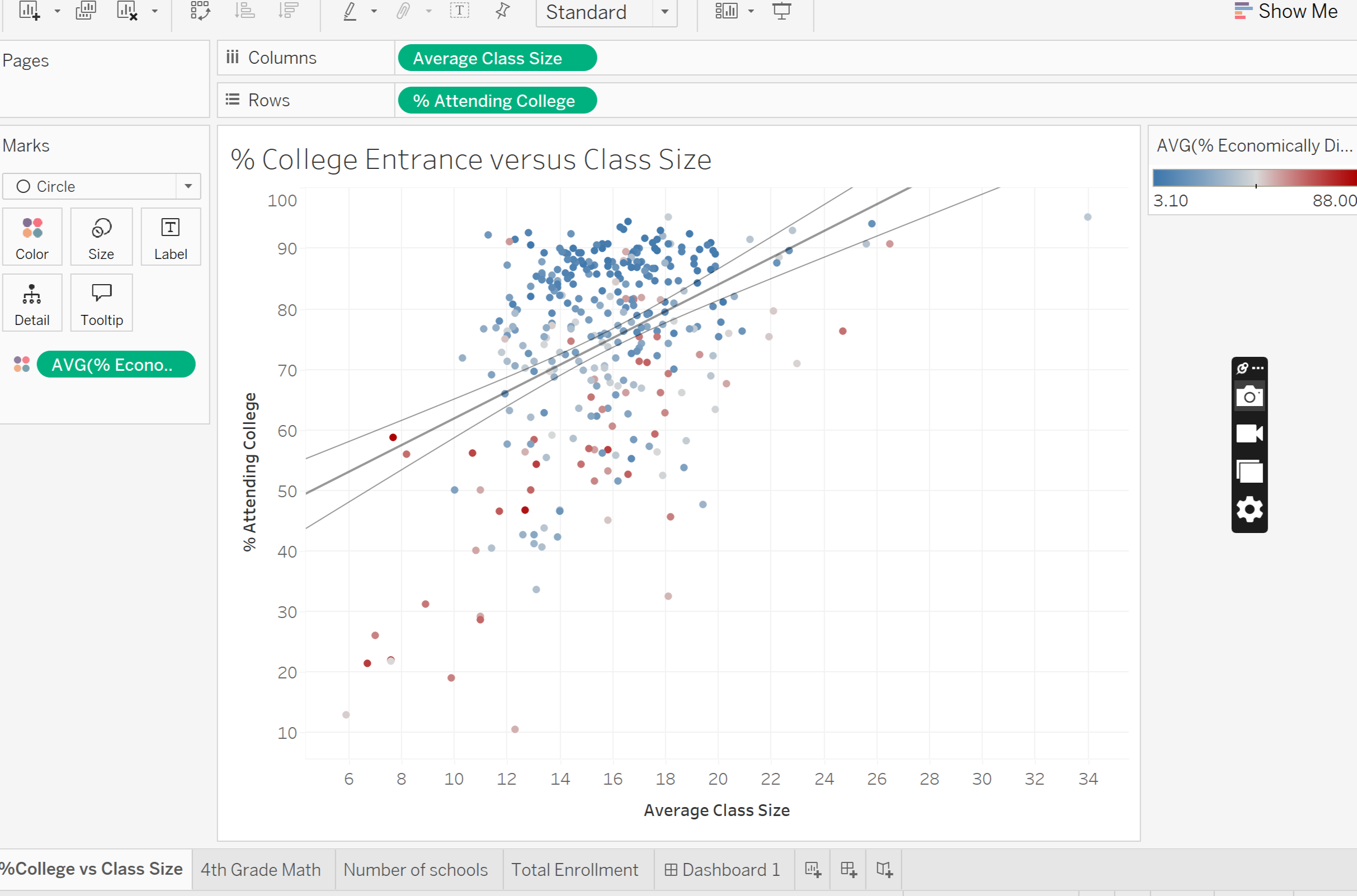
As for me—I’m not a visual designer, but tools like Tableau and Power BI help bridge that gap. They allow me to create dashboards that communicate clearly, even if design isn’t my strongest suit.